PIN DESIGN
2018 - Gremren Designs (Personal work)
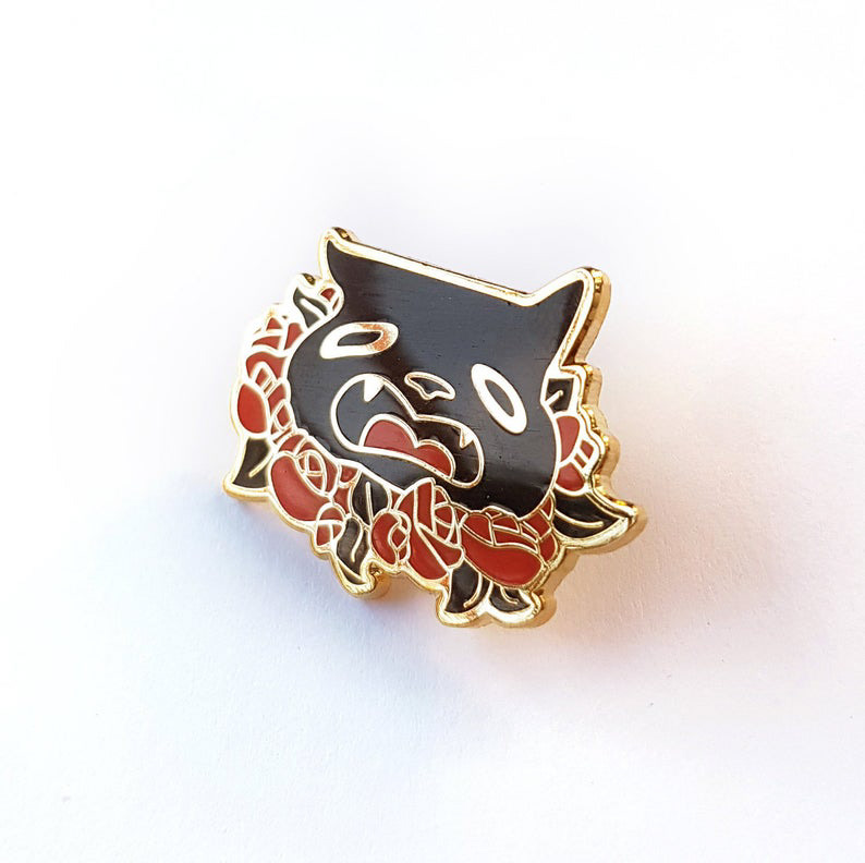
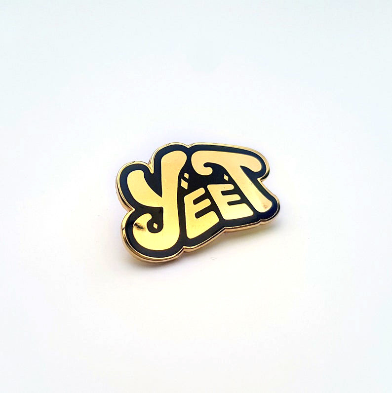
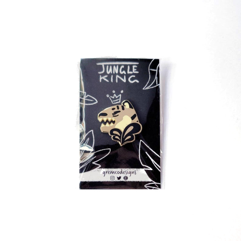
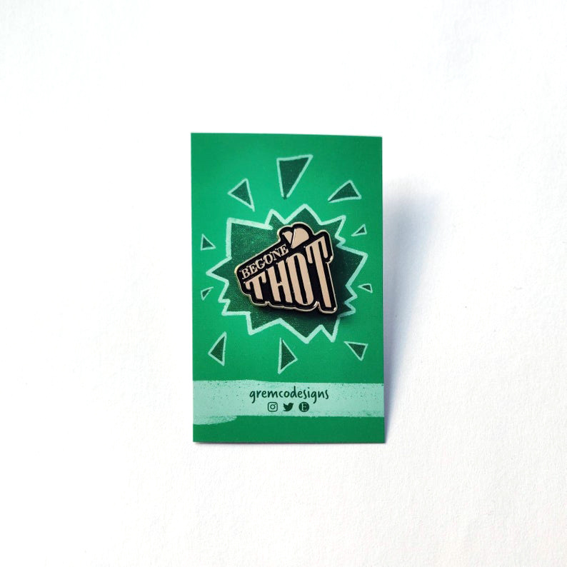
When opening up my online store, I set myself a challenge of translating my illustrative work into enamel pin designs. This involved researching the design and manufacturing process, translating my work into clean production artwork, and collaborating with a manufacturer.
The goal of this this work was to create pins from my work that were bold, visually clear, and had a broad market appeal.
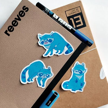
NOTEBOOK DESIGN
2017 - Natural Predators Series
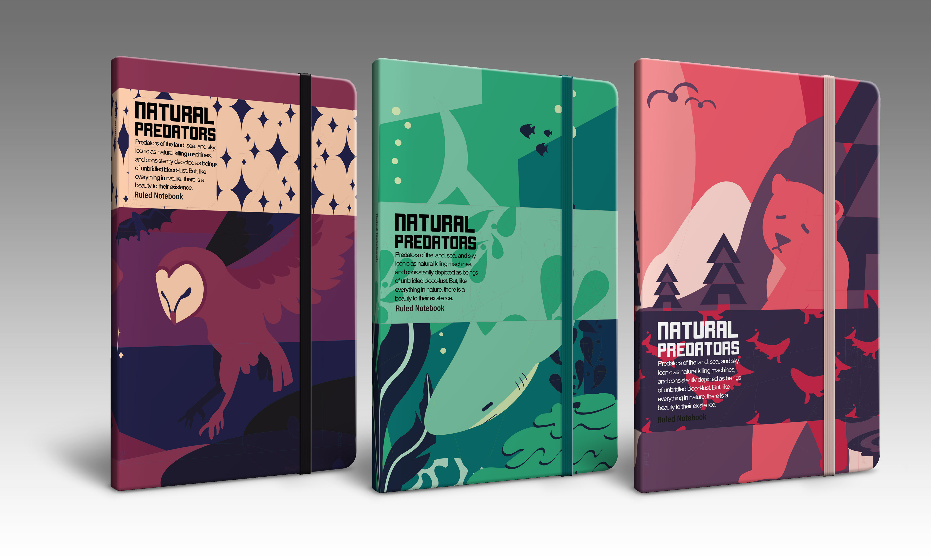
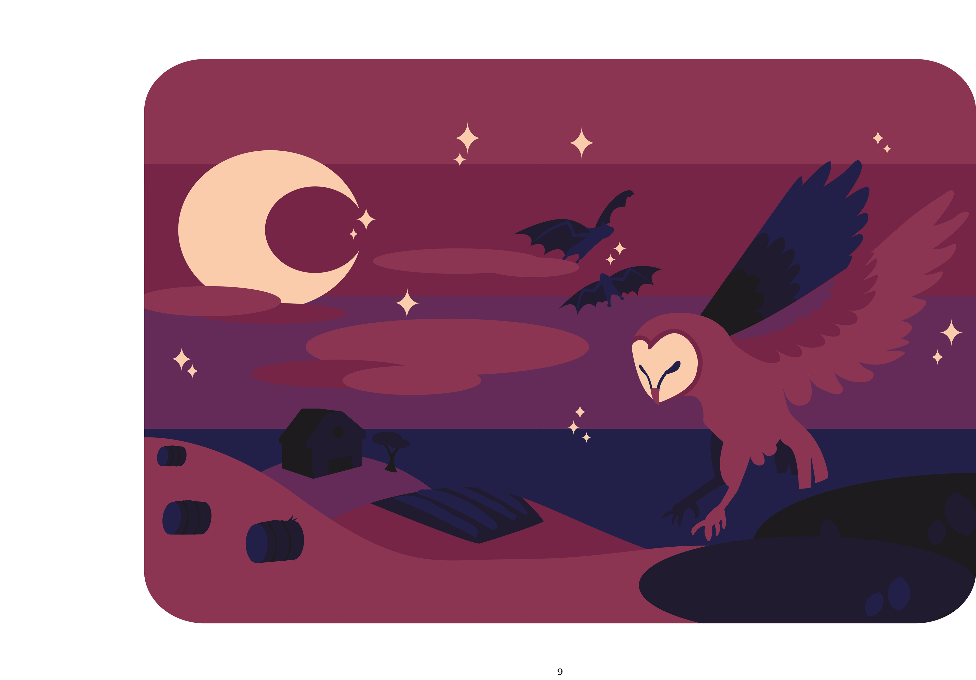
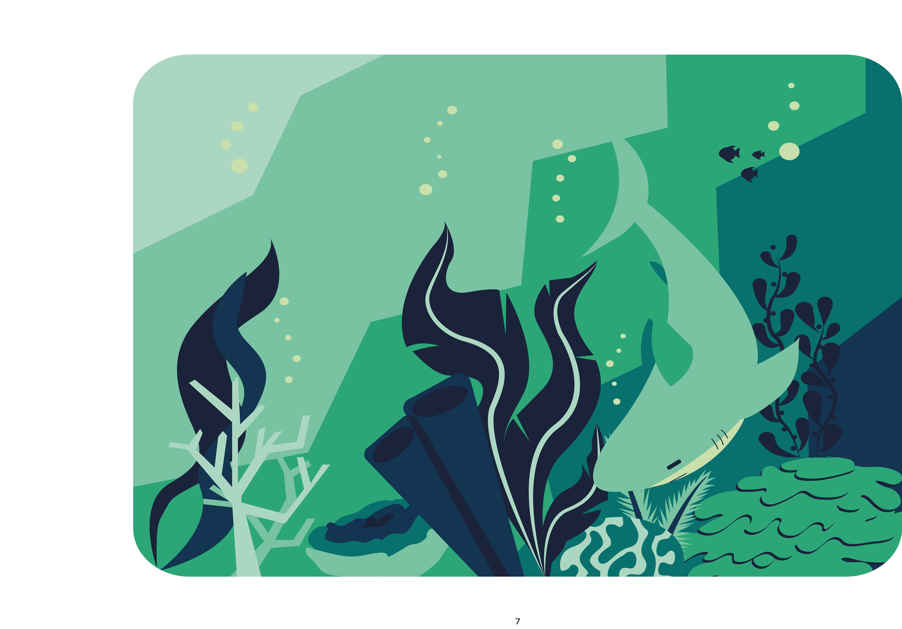
Working purely with vector graphics in Adobe illustrator, this brief revolved around producing a series of three notebook cover designs, with corresponding bellybands. All steps of the design process were decided on by me, from initial concept, to styling, to final design execution.
The goal was to create a cohesive series of designs, using a limited but bold colour palette, with clean lines and strong shapes.
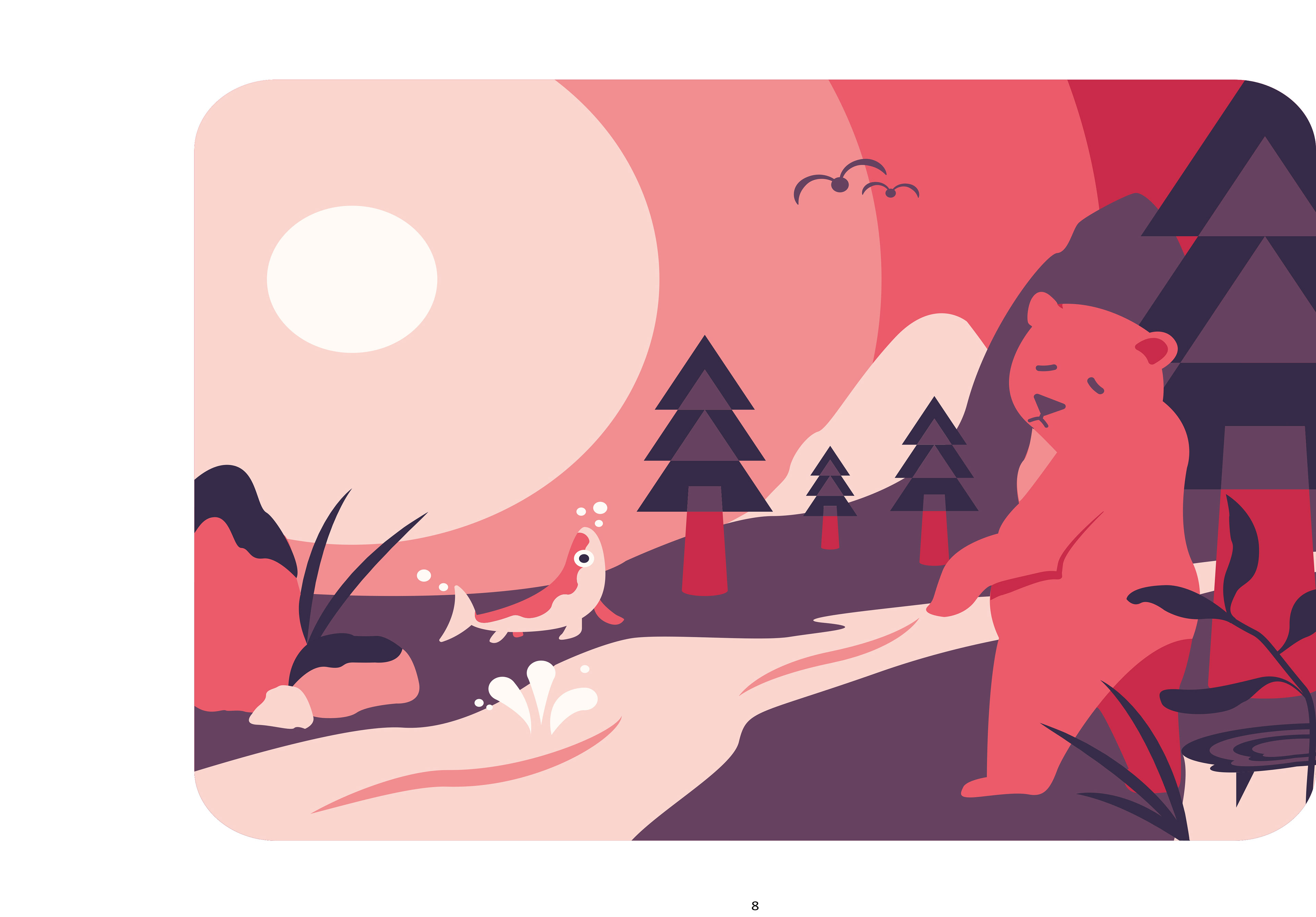
MELBOURNE FOOD & WINE FESTIVAL
2017 - Final Collateral Design
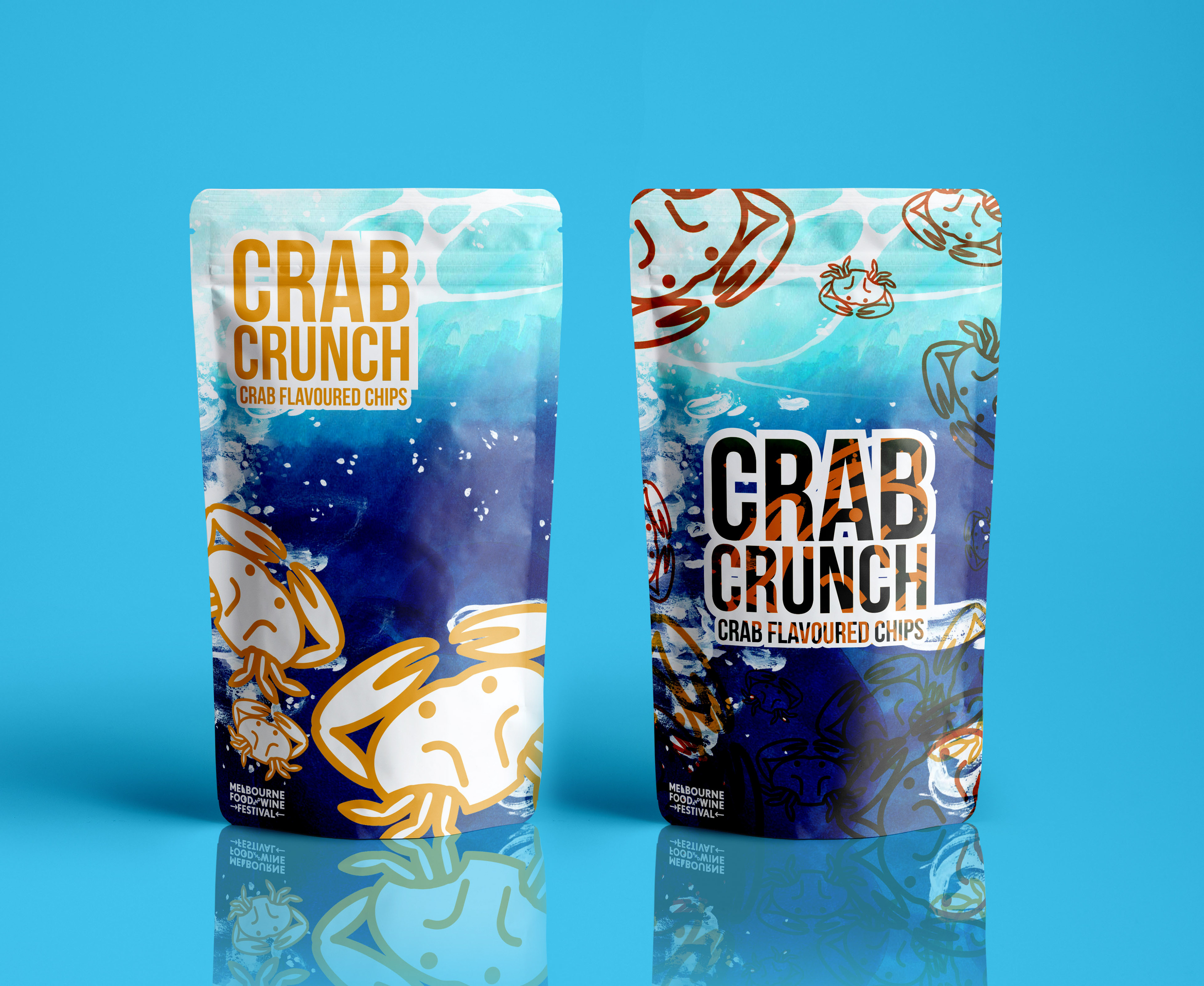
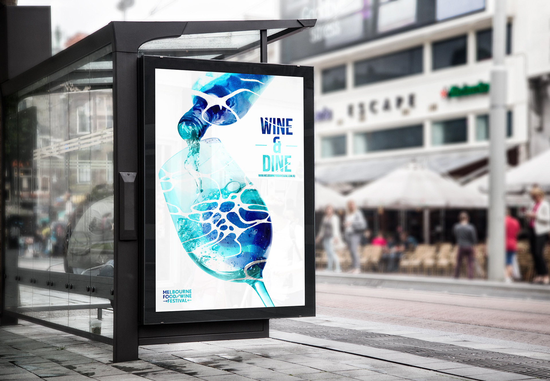
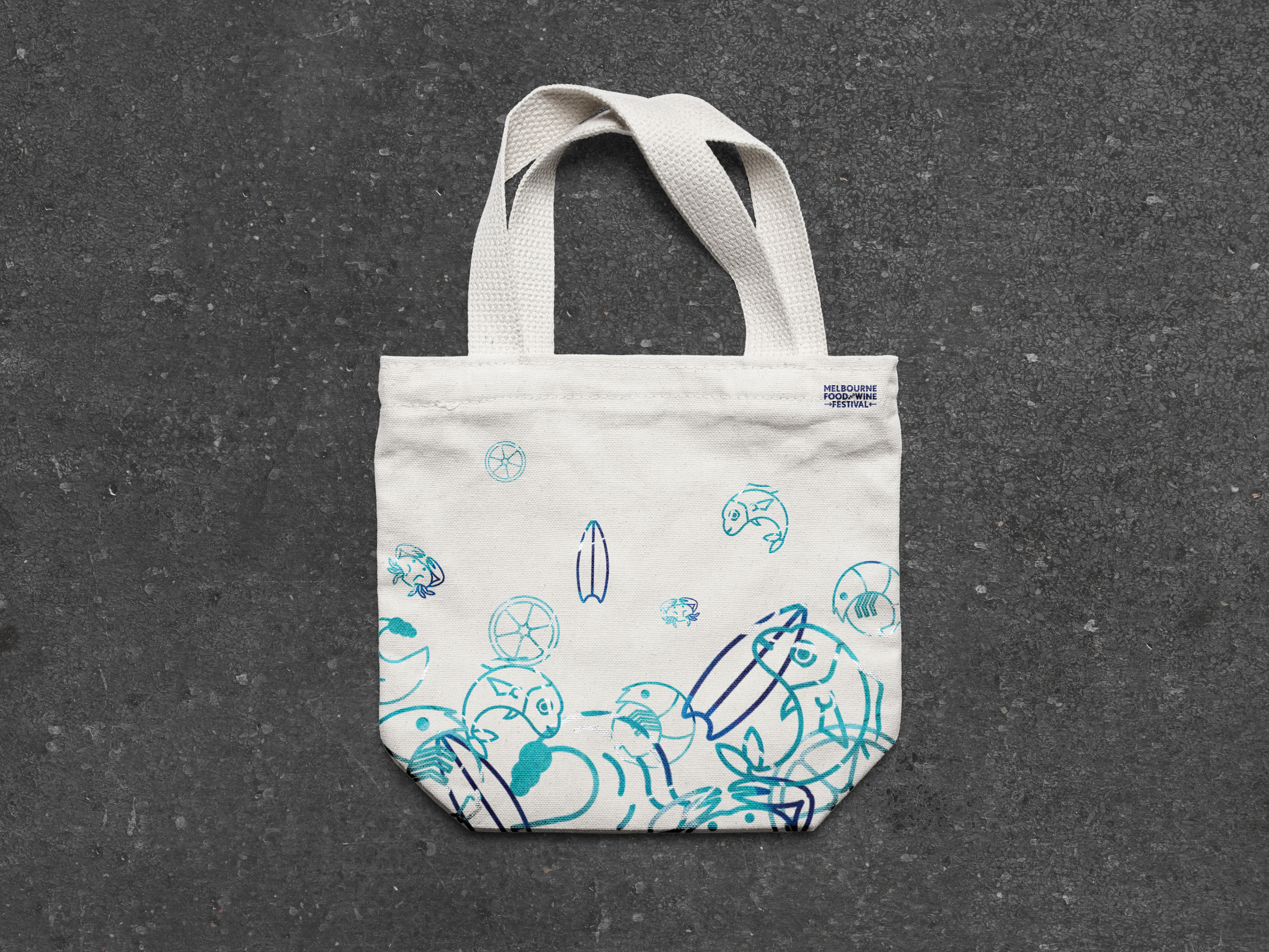
This brief called for the creation of a suite of designs to be used in conjunction with the Melbourne Food and Wine Festival. One final illustration was created, and then applied throughout an array of layouts, keeping all solutions visually cohesive.
Being able to push my iconography skills, and integrate them with traditional illustrations really showed me how vector designs can be elevated by an additional visual layer. It was also very satisfying to work with Photoshop mock ups to see my designs be brought to life.
IMPRESSTIK BROCHURE AD
2019 - Print Media Group
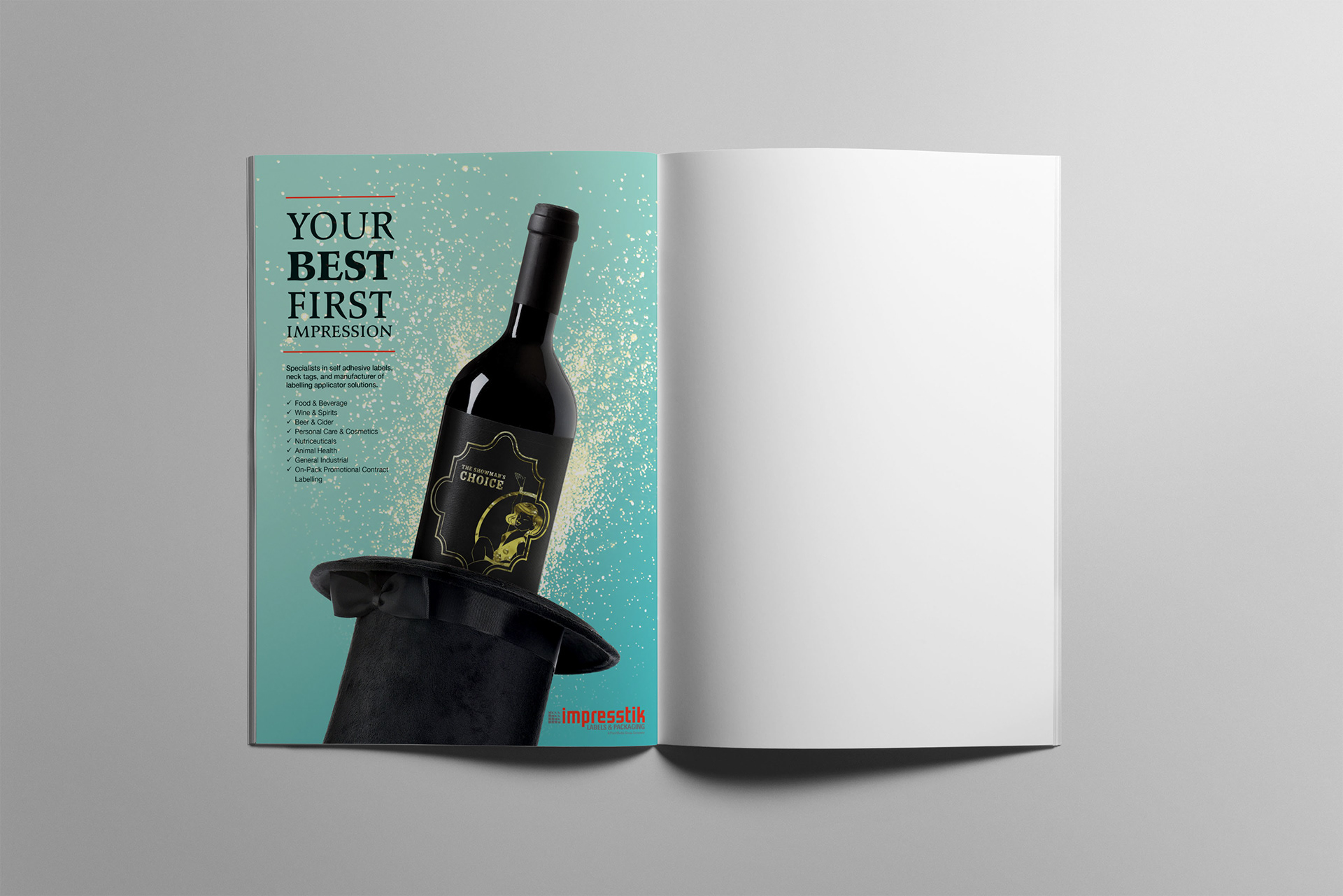
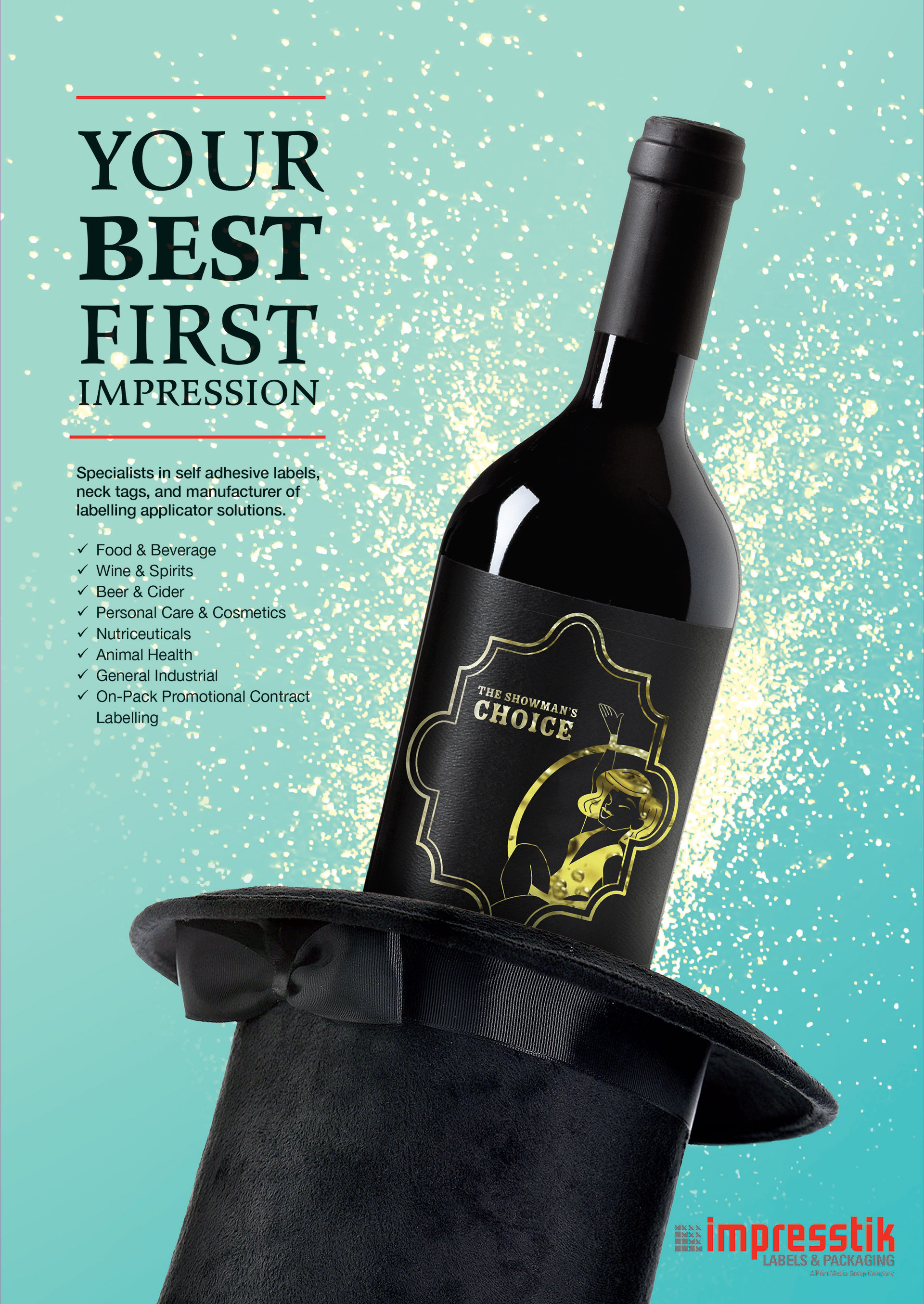
This brief required an A4 ad to be created fin Photoshop for Impresstik labels, to be inserted into a booklet for the Starlight Gala ball (“Star Ball”) booklet. The requirements were to adhere to the Star Ball’s 2019 theme of “The Greatest Showman”, while also showcasing Impresstik Labels for their specialised wine labelling services.
As the initial brief was incredibly short and vague, the biggest challenge here was to collaborate with multiple people within Print Media Group to get a better understanding and scope of the project, and take initiative to ask for feedback during the design process.
MUSEUM INFORMATION PACK
2017 - Bioluminescent Sea Creatures
This brief required researching a NGV exhibition, and creating an information package to accompany it, using specialised printing processes to enhance the information and design.
I chose the subject of bioluminescence, utilising white-ink printing on black paper stock to embody the relationship between the pitch black ocean, and the organic light sources. For mock up purposes, I also applied a blacklight-reactive ink to all the collateral, and included a blacklight torch in the kit, allowing viewers to have a heightened level of interaction with the design.
This project was vital for my knowledge of specialised printing file set up, through the use of spot colours.
THE GHILLIE DHU
2017 - Folklore Magazine and Collateral Design
This illustration class involved the creation of six separate visuals centred around a myth / legend / folklore, to be utilised for a final digital-zine design, and event design collateral. All illustrations had to be in a different medium, with the main challenge coming from the
final design integration stage.
With my legend being the Ghillie Dhu, a Scottish forest faerie, I pushed myself to create visuals that were modern, and outside of my comfort zone.
IPAD SPLASH SCREENS
2017 - Earth Digital Magazine
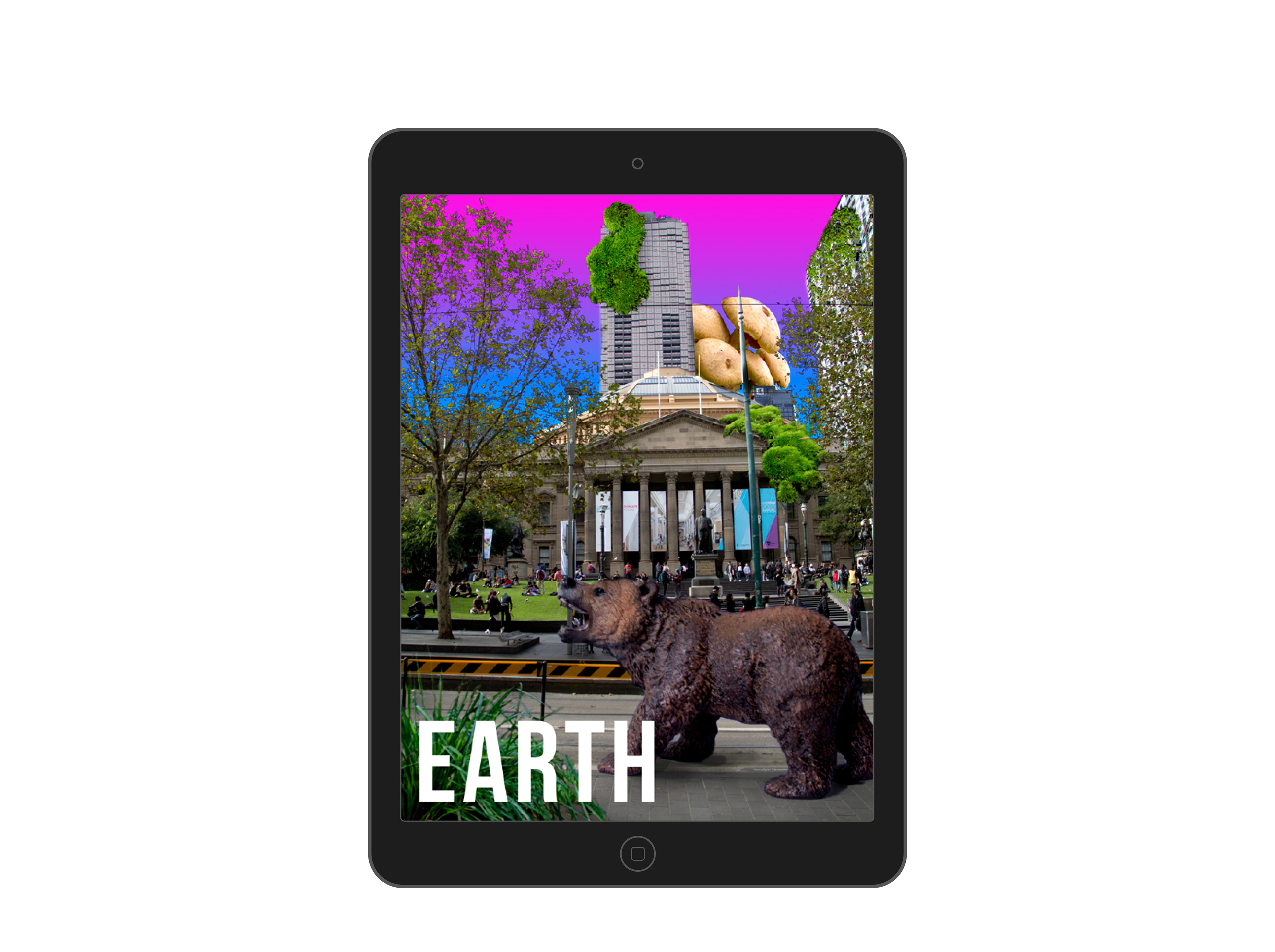
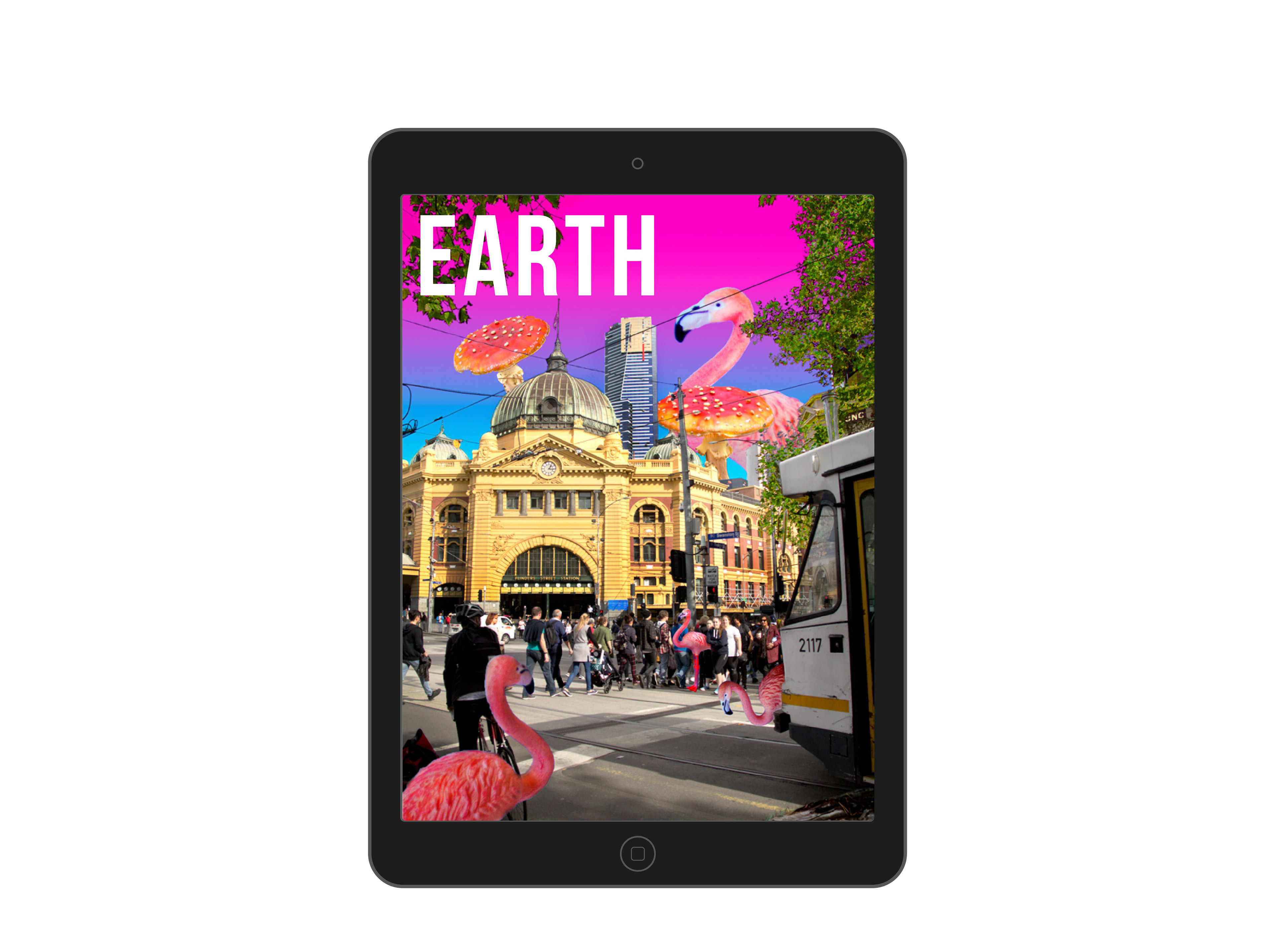
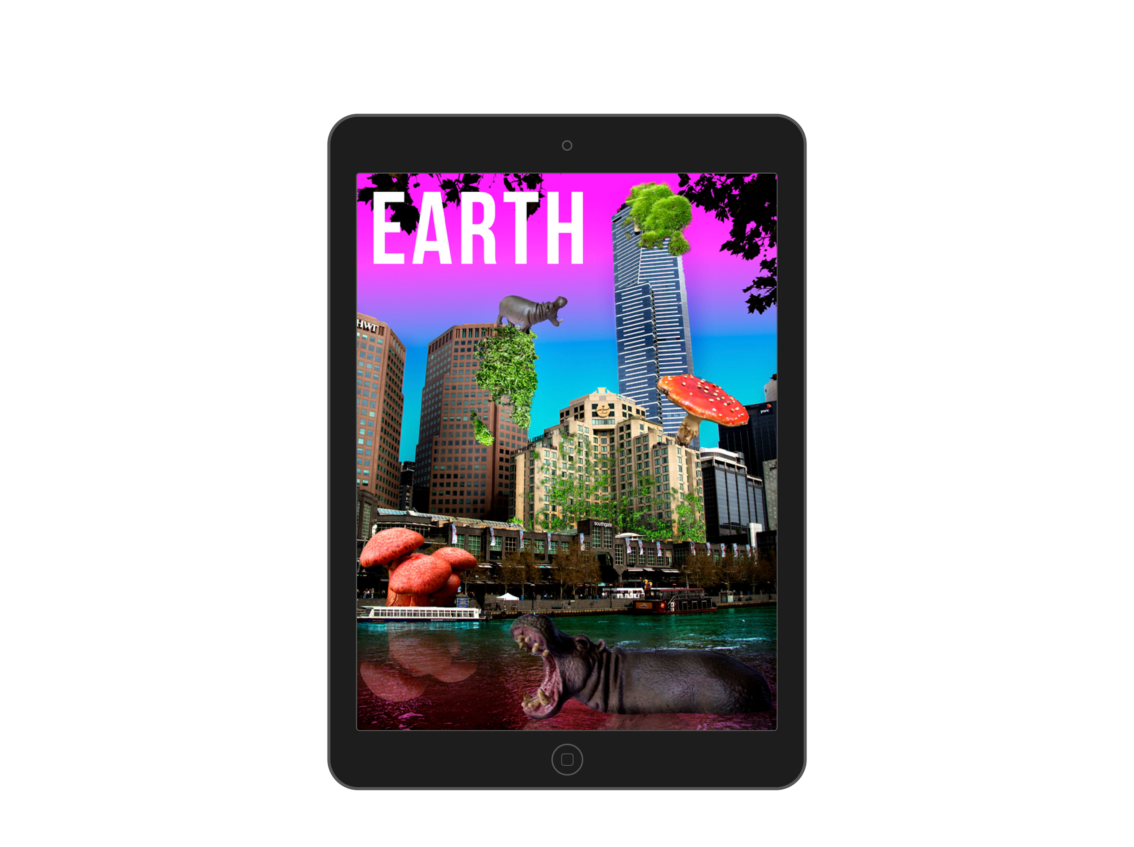
Utilising Photoshop, this brief required the creation of three splash screens for a digital magazine. Adhering to iPad dimensions, we were required to create a central theme, along with choosing a “core word” that brought all of our designs together.
For this project, I chose the core word “Earth”, with my theme being the integration of the natural, and the man-made. A variety of Photoshop techniques were applied to incorporate all the separate elements as smoothly as possible.
A5 RISOGRAPH PRINTS
2019 - Gremren Designs (Personal work)
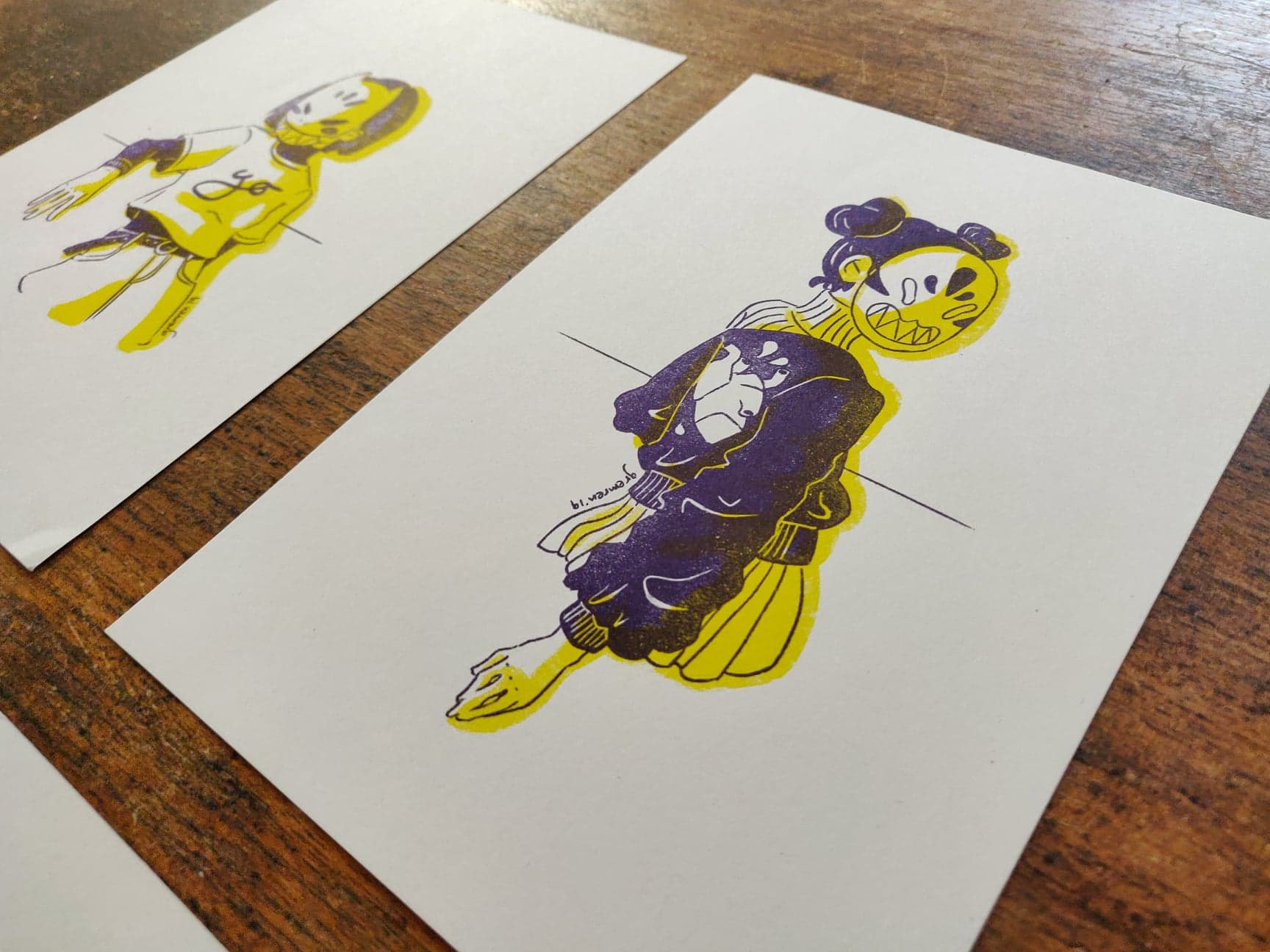
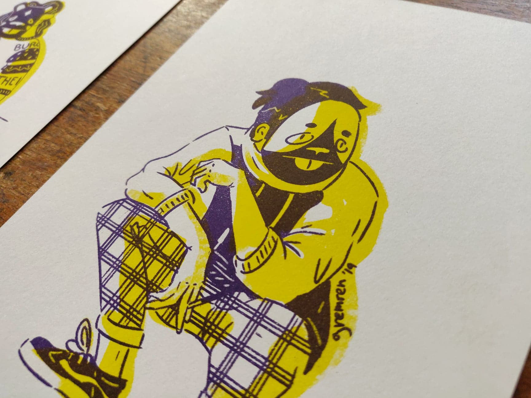
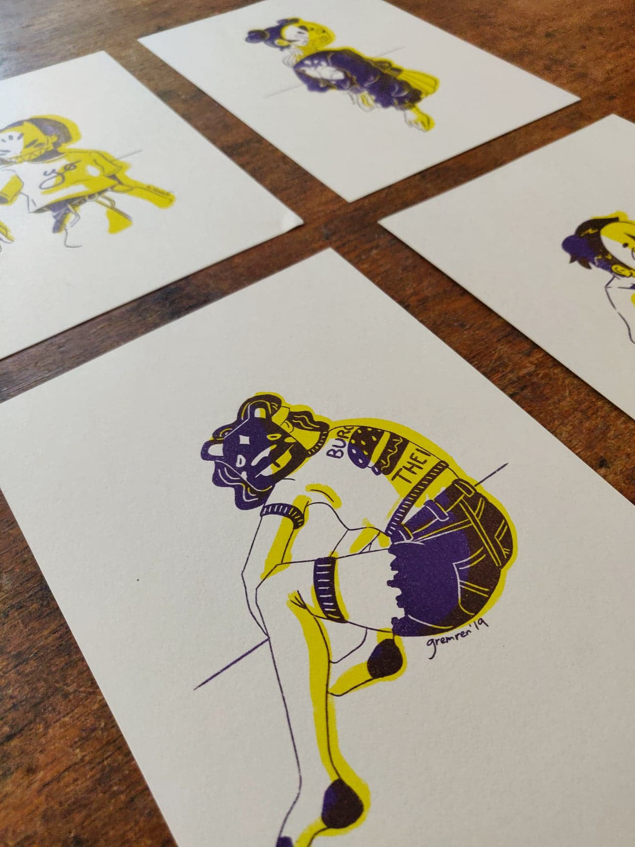
In preparation for an artist table, I selected 4 of my illustrative pieces to turn into a two colour risograph print series. As these were all in different media formats (Photoshop, Copic marker, and Posca marker), the pieces needed to be recreated into one cohesive digital format, and then translate them into layered black files that were ready for print.
The challenge here was the proper file setup, involving extensive research and collaboration with the printer, but resulted in prints with a tactile feel, and unusually vibrant colours.
BRANDING AND IDENTITY DESIGN
2016 - Telltale Publication
For this brief, we were required to select a job field, and create a brand identity from the ground up. This included all brand design work from start to finish, along with 16 brand applications (business cards, tote bags, bus wraps, etc), and a final physical book, detailing all work for the final brand identity.
This assignment gave my an intrinsic understanding of brand and logo creation, along with an exciting taste of the book binding process, as well as the time management needed to effectively design and bind a physical book.
STICKER DESIGNS
2019 - Gremren Designs (Personal work)
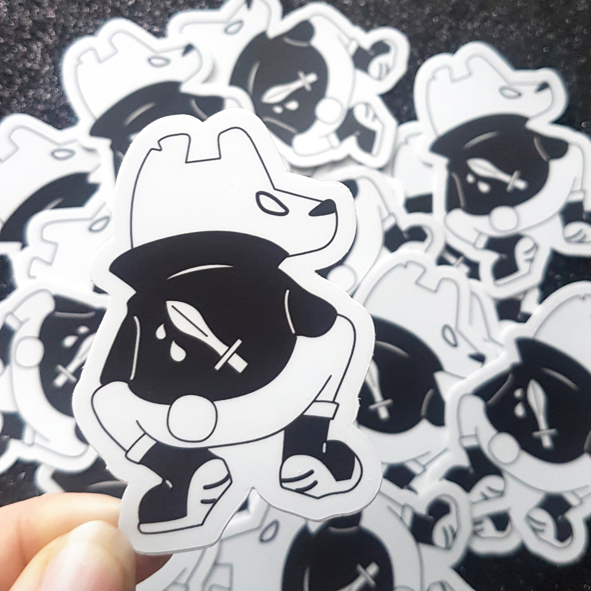
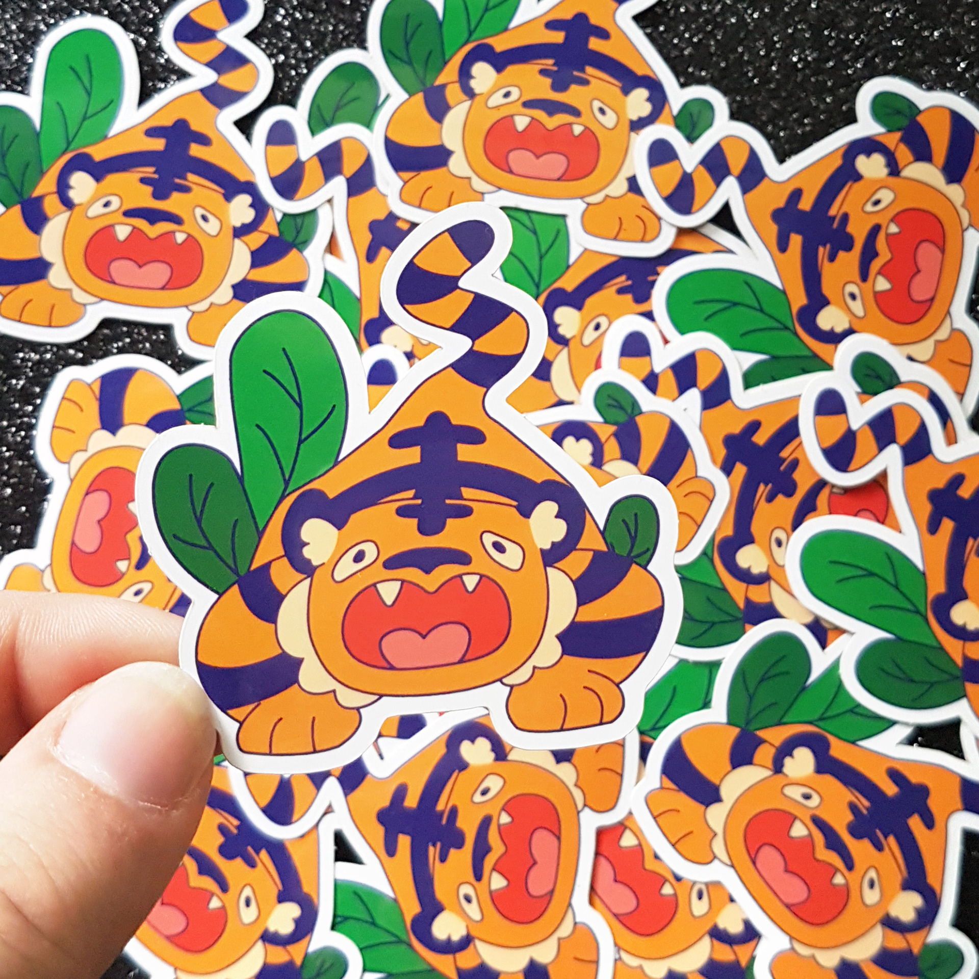
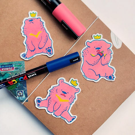
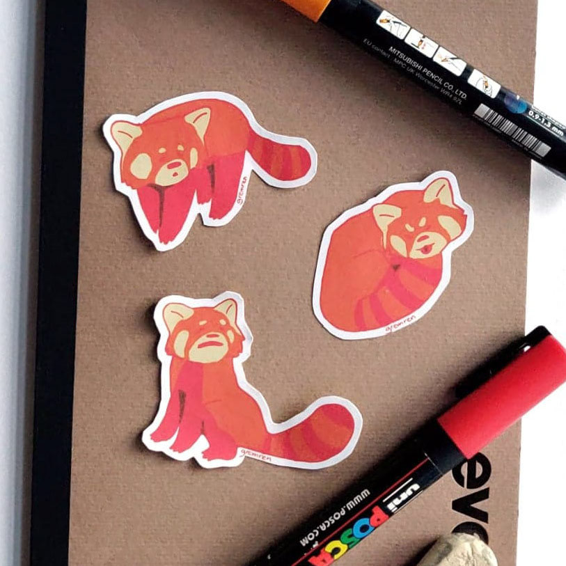
The goal of this work was to translate my illustrations into a product that was low cost, and easily accessible to customers.
Different production processes were experimented with to better understand their results, along with their appeal to consumers. Initial work was put into professionally printed vinyl stickers (the black / white bear and tiger), which better informed me on how to set up sticker files for print.
Next, I experimented with personally printing stickers (bears and red pandas), and challenged me to properly clean up my scanned illustrations, while also finding the optimal printer settings for a clean print, with accurate colour representation.
